We always speak of time in spatial terms. Time is long or short; past and present are either distant or near. We say that time moves, and that it does so either slowly or quickly — as objects do.
This is probably inevitable, because all notions of time are intrinsically abstract. We are uncomfortable with this, and try to ease the pains of abstraction not just through language but also through the things we make. Think of a clock whose arms move through space, measuring the hours and minutes and seconds on an unvarying backdrop whose sixty dashes resemble a ruler bent into a circle.
Given the pervasiveness of our spatial metaphors for temporal experience, it cannot be surprising that for a very long time there has been a species of historian called a chronographer — that is, a person concerned to graph, to create visual representations of, the passage of history. But, as Daniel Rosenberg and Anthony Grafton ask in the first words of their enlightening and delightful Cartographies of Time, “What does history look like? How do you draw time?”
Early answers to that question suggest that you don’t really draw it at all. Consider this excerpt from the Annals of St. Gall, a yearly chronicle from an early-medieval Frankish monastery, which looked like this:
| 709. | Hard winter. Duke Gottfried died. |
| 710. | Hard year and deficient in crops. |
| 711. | |
| 712. | Flood everywhere. |
| 713. | |
| 714. | Pippin, mayor of the palace, died. |
| 715. | |
| 716. | |
| 717. | |
| 718. | Charles devastated the Saxon with great destruction. |
| 719. | |
| 720. | Charles fought against the Saxons. |
| 721. | Theudo drove the Saracens out of Aquitaine. |
| 722. | Great crops. |
| 723. |
Even leaving aside the number of years in which, according to the chronicler, nothing happened, this is a pretty rudimentary accounting. However, there is a kind of shape to it: it is the simplest form of a table, with two columns, the first containing dates and the second containing events. And the dates move in perfectly unvarying order. It’s a start.
Some centuries earlier, Rosenberg and Grafton explain, the great Christian scholar Eusebius of Caesarea had produced a Chronicle of world history, a book in which he created a more expansive but structurally similar table: the years ran down the page on the left side, and in parallel columns Eusebius noted key events in the histories of nineteen different nations, some ongoing (the Romans), some long departed (the Assyrians). Among other things, this allowed Christians to see Biblical history in relation to pagan history, which must have had a mixed effect: on the one hand, it grounded the persons and events of the Bible in a known world — Jeremiah and Thales were contemporaries — but it also suggested that the Biblical story isn’t the only story there is.

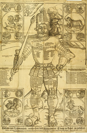
Woodcut of the statue described by the prophet
Daniel, from Lorenz Faust’s Anatomia statuae
Danielis (“An anatomy of Daniel’s statue”), 1585.
[Click to enlarge.]In any event, the Chronicle of Eusebius was the chief model for the graphical representation of history for about a thousand years. But there were alternatives. Cartographies of Time is lavishly illustrated, and one of the many pleasures of reading it involves seeing the experimental diversity of the chronographers’ work. Long scrolls from the Middle Ages show trees (especially when genealogies are involved), linked rings, medallion-like circles containing drawings of kings’ faces connected by lines, and so on. One sixteenth-century scholar tried to follow a curious Biblical model: the statue described in the second chapter of Daniel, with its body parts made variously of gold, silver, brass, iron, and clay. A woodcut (right) shows Daniel’s statue, its organs and extremities labeled with the names of kingdoms and rulers. Alas, this model has distinct limitations as a means of representing universal history.
All of these approaches struggle not just with finding useful spatial metaphors, but also with the problem of difficulty: if Daniel’s idol is too simple, more complex models yield greater fidelity to the facts at the expense of readability and comprehensibility. Rosenberg and Grafton try to argue that complex chronography at least had the effect of bringing readers in a very active way into the books it was presented in, because it demanded so much of them; but this may be a form of special pleading. Often the complexity is just plain confusing.
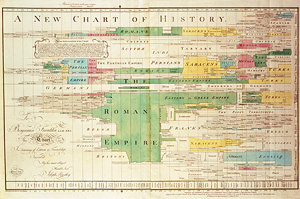
As Rosenberg and Grafton tell the story, around the middle of the eighteenth century — “middle”: another spatial metaphor — these various approaches started to converge on a particular model of representing time. The key figure turns out to be Joseph Priestley, the famous dissenting minister and scientist, who was inspired by an enormous Chart of Universal History produced in 1753 by an English cartographer and engraver named Thomas Jefferys. Jefferys’s chart is extraordinarily ambitious, squeezing thousands of words into a colorized table, and while Priestley liked it, he also thought Jefferys had gone wrong by failing to preserve consistency of scale: the intervals in his rows of dates, which run vertically down the page, vary from one hundred to five hundred years.
Priestley remedied this error, starting with his Chart of Biography (1765). Here the dates run in unvarying intervals, like a clock’s designation of minutes and seconds, and they run horizontally, to give the sense of time moving rightwards, that is, in the direction of reading. The chart is separated into six horizontal bands, each indicating types of famous persons: Historians, Antiquaries, and Lawyers; Orators and Critics; Artists and Poets; Mathematicians and Physicians; Divines and Metaphysicians; Statesmen and Warriors. Each name on the chart appears over a line indicating the length of the person’s lifespan. Priestley commented, “It is a peculiar kind of pleasure we receive, from such a view as this chart exhibits, of a great man, such as Sir Isaac Newton, seated, as it were, in the circle of his friends and illustrious contemporaries. We see at once with whom he was capable of holding conversation.” (The right side of Priestley’s chart — that is, in the portion devoted to recent history — is densely populated, whereas the left side of the chart is comparatively empty. This is largely a function of historical ignorance, of course — we don’t know nearly as much about Archimedes’ colleagues as we do about Newton’s — but the appearance of the chart tends to reinforce a powerful narrative of intellectual progress.)

Joseph Priestley’s New Chart of History,
dedicated to Benjamin Franklin, 1769.
[Click to enlarge.]Pleased with this way of representing time, Priestley then went on to improve on and correct Jefferys’s chart in his 1769 New Chart of History (left). Here too Priestley runs his dates across the page from left to right, and Rosenberg and Grafton comment that he preserved the same scale he had used in his biographical chart “so that data from one could be lifted directly and moved to the other.” Each row of the table represents a region, but they appear in an odd order, with European nations gathered at the bottom of the chart and the rest of the world at the top — which means that the Roman Empire, though helpfully colored in green, appears in no fewer than six non-contiguous places on the chart.
And it’s big: very big. (Frustratingly, Rosenberg and Grafton rarely tell us just how large the documents they reproduce are.) Even though Cartographies of Time is a sizable book — about 8.5 by 10.5 inches when closed — almost none of the charts it describes are reproduced at anything close to their actual size, and most of them are nearly or wholly unreadable on the book’s pages. I was able to get a decent look at some of them only by taking my glasses off — I am very near-sighted — and bringing my eye very close not to the page itself but to the round magnifying lens that came with my compact edition of the Oxford English Dictionary. For that matter, figuring out how to view these charts properly would not be easy even for a person looking at the original. Get close enough to note the details and you lose sight of the overall pattern; stand far enough back to discern that pattern and you lose the details.
One French scholar contemporary with Priestley, Jacques Barbeu-Dubourg, produced in 1753 a Chronographie universelle consisting of a scroll that fits neatly into a wooden case, with a mechanism that rolls the timeline forward or backward, exactly as we would “scroll” on a computer’s screen, though horizontally. The sheet of paper on which the timeline is written runs from the Creation to the date of its own creation and is fifty-four feet long. (Princeton University owns one of these devices, and it still works.) Barbeu-Dubourg decided to sacrifice the big picture altogether to the details, whereas a wall chart like Priestley’s allows always for a view of the whole.

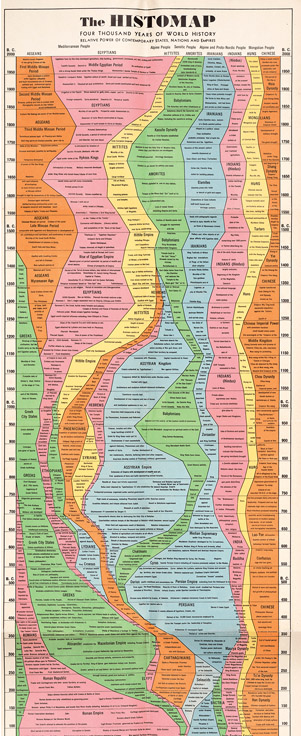
Detail from John Sparks’s Histomap
for Rand-McNally, 1931. [Click to enlarge.]Whatever its flaws, Priestley’s tabular model became and remains the dominant one. There were of course alternatives: arboreal models continued to have a place, and in the second half of the nineteenth century, “stream” metaphors had a certain vogue. In 1931 an amateur historian named John Sparks produced a tall downward-flowing multi-colored stream-map of world history called the Histomap (right). Rand McNally published it and it sold well for half a century, along with Sparks’s later Histomap of Religion and Histomap of Evolution: Earth, Life and Mankind for Ten Thousand Million Years. But Priestley’s core idea, that time should move horizontally across the page from left to right, and in unvarying intervals, became the undisputed champion of chronographic schemes.
A justly famous variant on the Priestley model is the Minard map, over which, thanks largely to Yale emeritus professor Edward Tufte, the world — or the geeky world, anyway — is in a permanent state of enrapturement. Charles Joseph Minard was a French civil engineer who in 1869 published a map portraying Napoleon’s disastrous invasion of Russia in 1812 (below). The timeline moves from left to right, according to post-Priestley orthodoxy, but since Napoleon moved from west to east, time and space gratifyingly move in the same direction. And here is Minard’s true innovation: a thick brown line represents the size of Napoleon’s army, which, as it flows east, gets thinner and thinner as men are killed in battle or die from the cold. Minard precisely calibrates the size of the line — one millimeter per ten thousand men — and then changes the color of the line to black to indicate the return journey. So the viewer’s eye follows the path from left to right and back again, resting, eventually, near the Niémen (or Neman) River in Lithuania, where immediately juxtaposed are the thick, bold, brown ribbon of the army upon its setting out and the black pencil-thin line representing the few who returned. It’s hard to imagine a more sobering map.

Charles Joseph Minard’s flow map showing the progress of the French army’s
1812-13 Russian campaign, 1869. [Click to enlarge.]
It’s also hard to imagine a more information-rich one, especially when one notes that Minard also included along its bottom a chart of temperatures the army experienced in its journey. No wonder, then, that Minard’s map is so often seen as the sine qua non of what Tufte calls, in the title of a book of his that includes it, The Visual Display of Quantitative Information. But it may not be helpful for future chronographers to meditate too much upon Minard’s achievement. He had a good deal working in his favor: a discrete event with a fixed beginning and ending; a spatial movement matching the by-then-familiar representation of time flowing from left to right; a key body of data — troop numbers — that lends itself to straightforward graphical representation. Few chronographers are so fortunate.
As Rosenberg and Grafton’s fascinating chronicle moves towards the present day, we see surprisingly few genuine innovations, and, to my eye at least, not many compelling images. (One exception: a diagram of the lines of influence that connect Cubism and modern abstract art to their influences and to other related art forms, by Alfred H. Barr, Jr.) Few of the recent examples constitute a real advance over Priestley’s tabular charts, and none of them contain as much information in as small a space as Minard’s map. Computer visualizations of data may be creating new possibilities for visual representation of ideas. For instance, Debategraph uses a “mind map” model, consisting of a graph of linked ideas, to connect debated topics to one another and to reveal the different positions taken; this allows the viewer to zoom in on particular debates or zoom out and see them in relation to other debates — all of this made possible by adding an element of motion. The fixed graphics of the charts and tables we see in Cartographies of Time may well have reached the natural limit of their informative and explanatory power.